Inside COT Screener
The positioning map: stretch against movement
Level and direction are different facts. A market can be stretched long and still buying, or stretched long and heading for the exit. The positioning map is the one view that separates them.
Most views in the app rank one number. The map plots two at once. How extreme a position is, on the horizontal. What it did this week, on the vertical. The combination sorts every market into four situations with four different meanings. The screenshots show the week of August 4, 2026.
The four quadrants
The vertical centre line splits the scale at 50; the shaded zones start past 20 and 80. The horizontal centre is a week of no change. That yields four labelled quadrants, and the labels say what the combination means.
- Crowding into longs, top right: stretched long and still buying. The position is extreme and not done growing.
- Unwinding longs, bottom right: stretched long, now selling. The extreme is coming apart.
- Crowding into shorts, bottom left: stretched short and still selling.
- Covering shorts, top left: stretched short, now buying back.
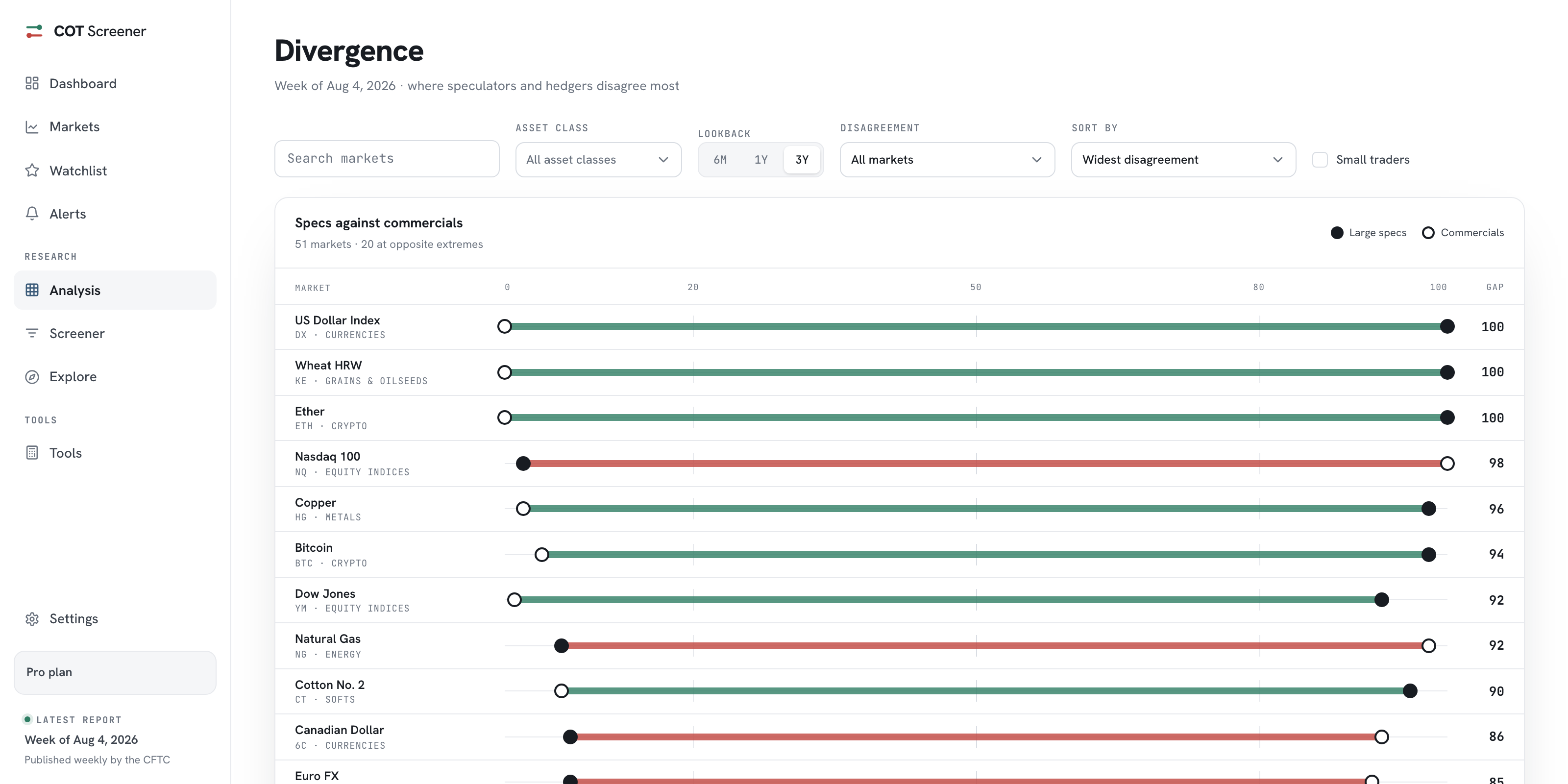
In the week shown, the US Dollar Index sat deep in the top right, a reading of 100 with heavy buying. Nasdaq 100 sat in the opposite corner, a reading of 2 and still being sold. Both are extremes, but they are opposite trades in motion.
Controls and labels
The bar above the map matches the section: search, asset class, trader group and lookback. The labels toggle switches between naming every dot and naming only the notable ones, which keeps a crowded midfield readable. Dots keep the scale’s colouring, red toward the short end, green toward the long end.
What to do with a corner
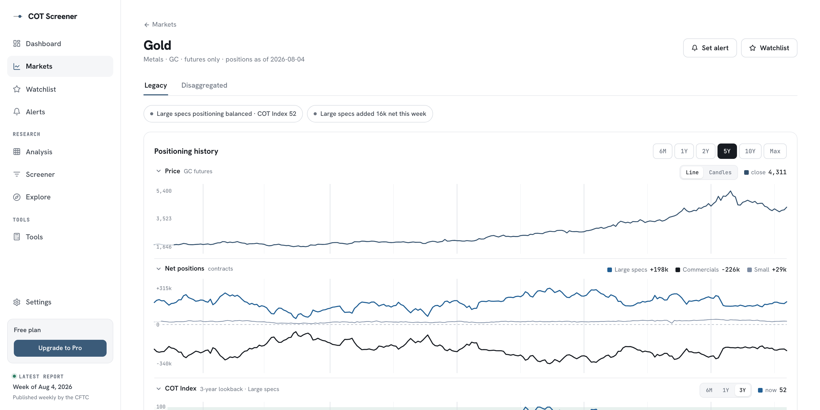
A dot in a corner is a candidate, not a conclusion. The next click is its market page, where the history shows how the position got there and what price did alongside. The extremes guide covers the other caution: extremes can persist for weeks, so the map is a radar, never a trigger.
Common questions
What are the two axes exactly?
Horizontal: the COT Index, 0 to 100, on your chosen lookback. Vertical: this week’s change in the group’s net position, expressed as a share of open interest so different market sizes stay comparable.
Why express the weekly move in percent of open interest?
Contract counts mislead across markets. Five thousand contracts is an earthquake in a small market and noise in a giant one. Dividing by open interest puts every move on one scale.
What does the Notable labels setting do?
It reduces the labels to the markets worth reading first, instead of naming every dot. The dots themselves always stay. Use it when the middle of the map gets crowded.
Which quadrant should I care about?
The corners, more than any one quadrant. Dots far from the centre combine a stretched level with a big move. The quadrant then tells you whether that stretch is still building or already unwinding.