Inside COT Screener
The trend view: twelve weeks in colour
A single COT Index reading tells you where a market stands. It cannot tell you whether it just arrived there. The trend view adds that missing dimension: the last twelve reports, one coloured square each.
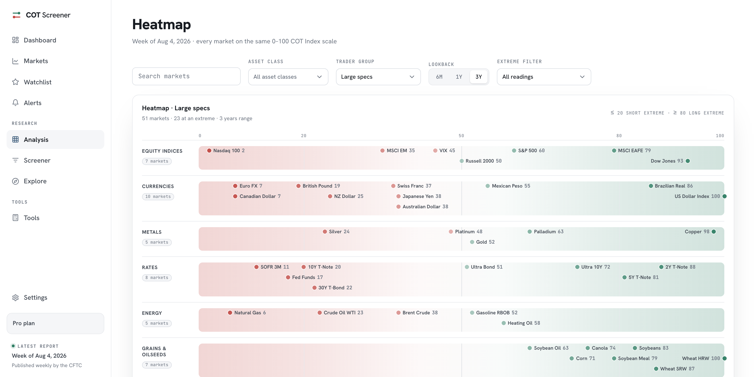
The trend view is the heatmap’s time-lapse. Where the heatmap shows one week across all markets, this page shows twelve weeks for every market, as a row of squares coloured by the COT Index. The screenshots show the week of August 4, 2026.
Reading a row
Each row is one market. The twelve squares are the last twelve CFTC reports, oldest on the left, and the emphasised NOW square is the newest. Red shades toward 0, the short end of the scale, green toward 100. Two numbers finish the row: the change against the prior week and the latest reading.
The patterns are the point. A row that fades from red to green is a position being built, week after week. A row that is uniformly deep green is a stance that has not moved in a quarter. A row that snaps colour in its last square is news. In the week shown, the Japanese Yen jumped 32 points in one report after eleven red squares. That square is the reason this page exists.
Sorting by what changed
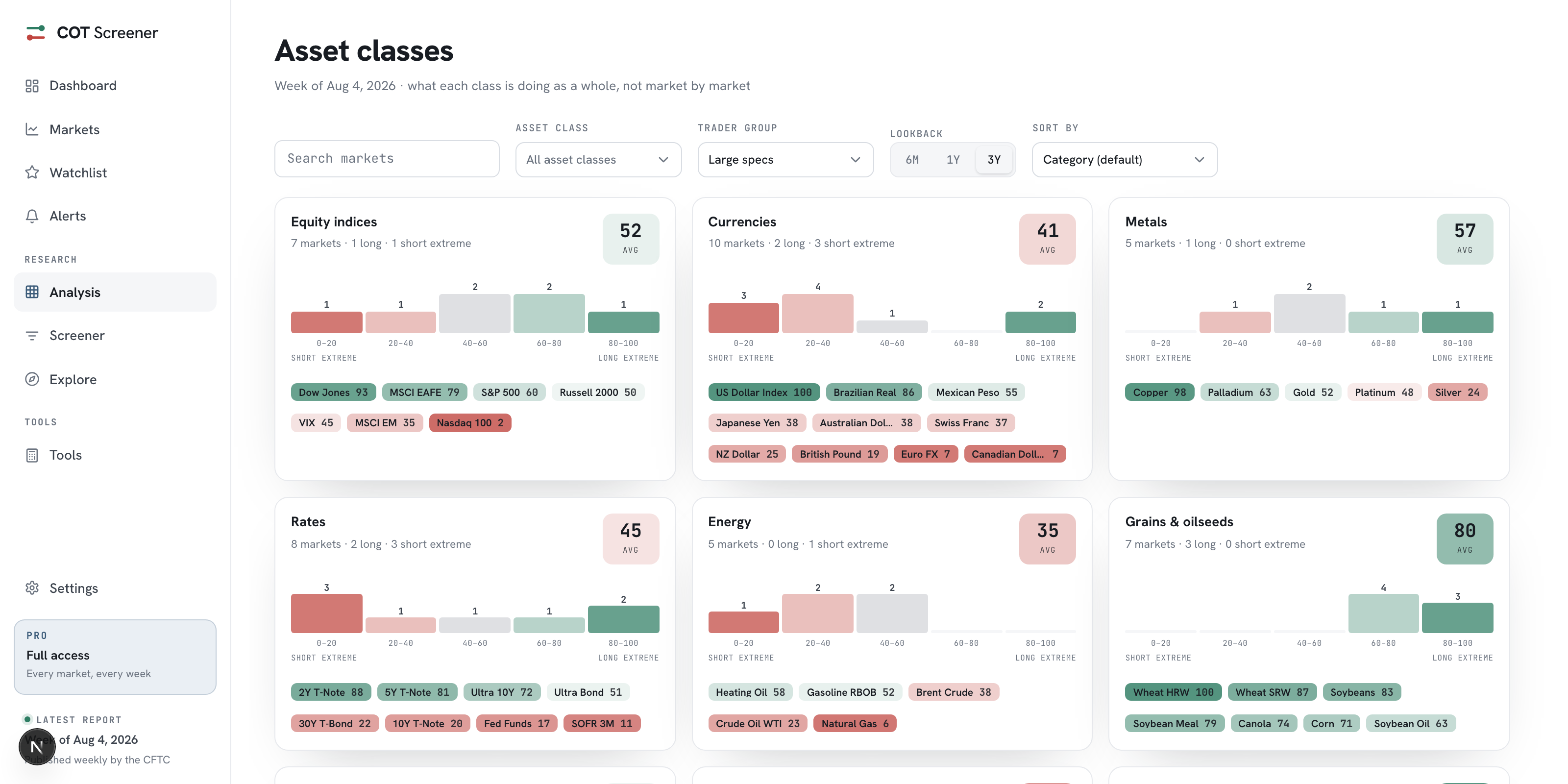
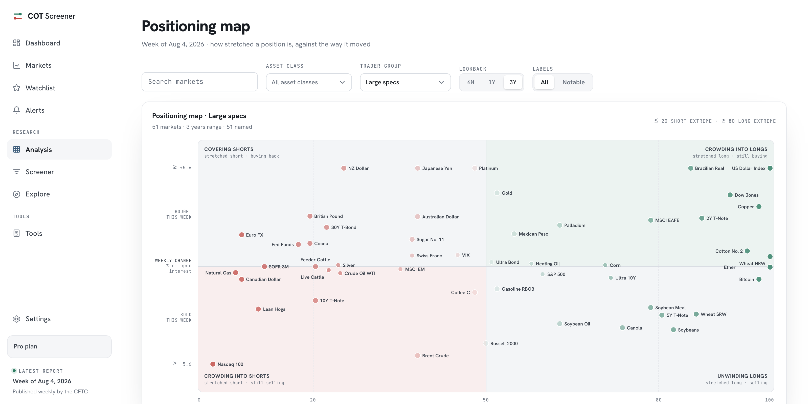
The default sort is the biggest shift, so the markets that moved most over the window rise to the top. The other controls match the heatmap: search, asset class, trader group and lookback, plus an extreme filter. A small dot next to some names marks markets whose speculators and commercials sit at opposite extremes.
From pattern to position
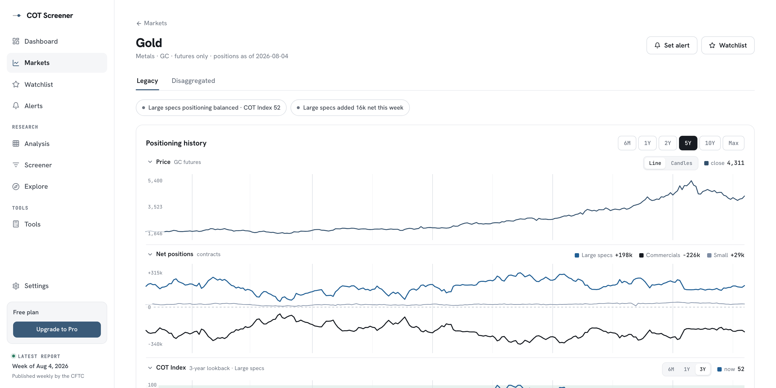
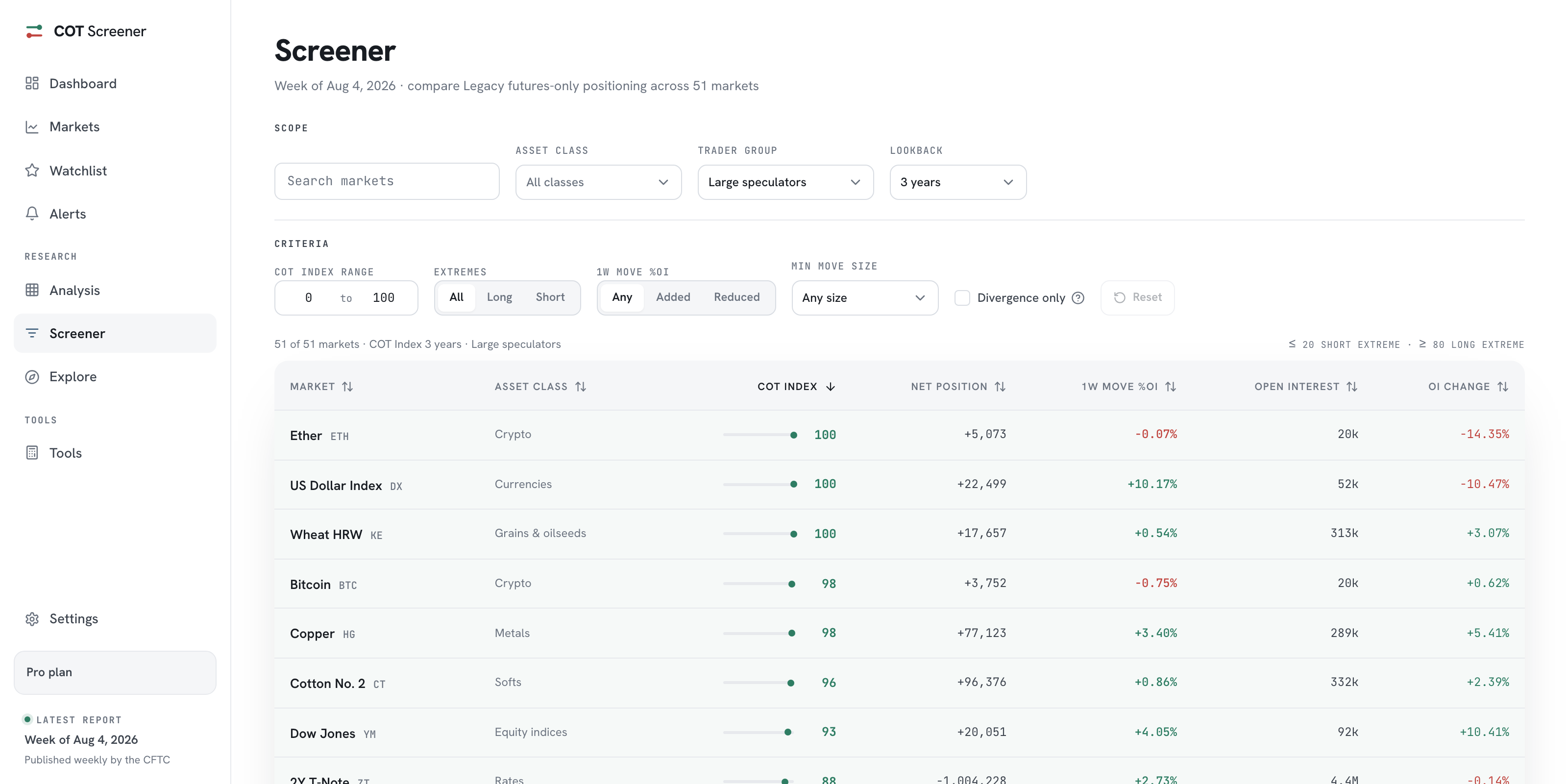
A row is a summary, not an explanation. Clicking its market opens the full analysis, where the same twelve weeks appear as lines with price next to them, and the report table shows which group actually moved. For a filtered list instead of a picture, the same question fits the screener and its weekly move filter.
Common questions
Why twelve weeks?
It is a quarter of reports. Long enough to separate a persistent build from a one-week move, short enough that every square stays readable on one screen.
What does the dot next to some market names mean?
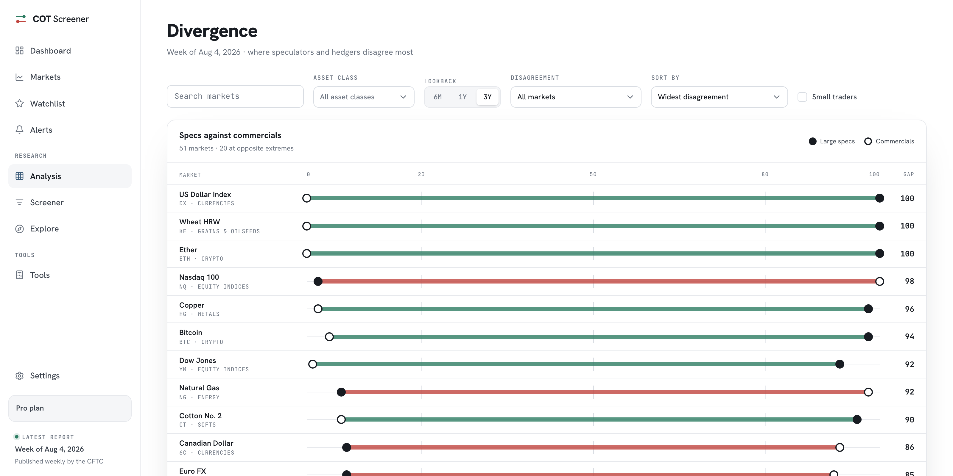
It marks markets where large speculators and commercials sit at opposite extremes, one at 80 or above while the other is at 20 or below. The divergence view ranks exactly these situations.
What does the Weekly Move metric show?
The same grid, recoloured. Instead of the COT Index level, each square shows how much the net position changed that week, as a share of open interest. Levels show where positioning is; moves show when it happened.
Which trader group does the grid follow?
Whichever you pick. The trader group menu switches the whole grid between large speculators, commercials and small traders, and the lookback rescores the colours over six months, one year or three years.